When my client approached me to revamp her professional website for Makeup by Yna, the goal was not simply to give the existing website a new look. The real objective was to create a digital experience that better reflected the quality, creativity, and professionalism behind her makeup artistry.
The original website already contained valuable content, including her services, portfolio, testimonials, social media presence, and contact information. However, the overall presentation had room to become more refined, visually engaging, and aligned with the premium beauty experience her clients expect.
This project became an opportunity to rethink the entire visual direction while preserving the personality and purpose of the original website.
From Existing Website to Refined Brand Experience
The redesign started with a careful review of the existing website and its content structure.
The original version had a more straightforward layout with large sections of information presented one after another. While it communicated the necessary details, I wanted the new version to feel more intentional and visually connected.
For the redesign, I introduced a warm, elegant visual direction built around soft neutral tones, warm brown accents, cream backgrounds, and subtle typography choices.
The result is a website that feels much closer to the beauty and bridal industry. It creates a sense of warmth and sophistication while allowing the photography and makeup work to remain the main focus.
Rather than treating every section as an independent block, I designed the page as one continuous story that guides visitors through the brand.
Creating a Stronger First Impression
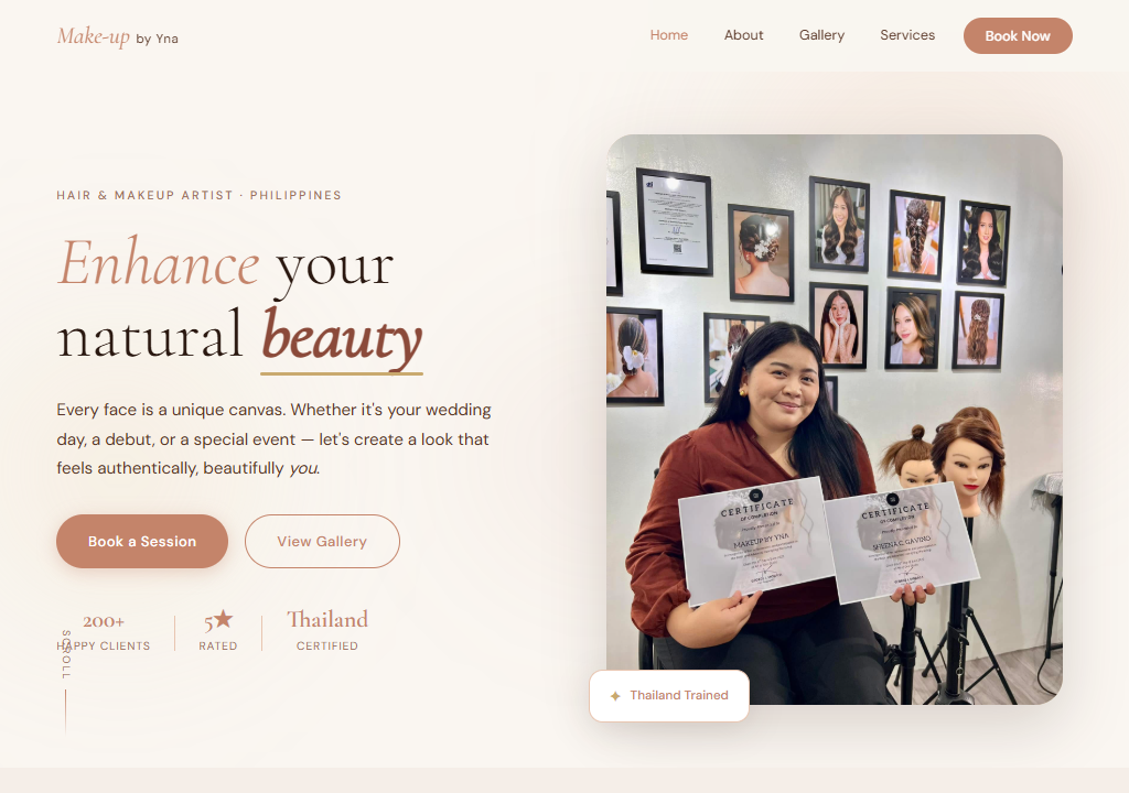
The hero section was completely reimagined to create a stronger introduction to Makeup by Yna.
The new homepage immediately communicates what the brand is about through a combination of elegant typography, a professional image, supporting text, and clear calls to action.
The headline, “Enhance your natural beauty,” establishes the brand’s philosophy from the beginning. It communicates confidence without feeling overly promotional, which is important for a beauty professional whose work focuses on enhancing each client’s individual features.
The introduction is followed by clear options for visitors to learn more or explore the work, making the first interaction with the website both visually appealing and practical.
Building a More Elegant Service Presentation
One of the major improvements was the way services and packages are presented.
The redesigned website introduces a structured What I Offer section featuring Debut, Wedding, and Special Events services.
Instead of presenting packages as plain information, I turned them into carefully designed cards with clear pricing and package details.
The highlighted middle card gives the Wedding service additional visual emphasis, helping communicate its importance within the business while making it easier for potential bridal clients to compare the available options.
This approach makes the information easier to scan while also giving the services a more premium presentation.
Bringing Her Story Into the Design
A professional website should not only show what a business sells. It should also help visitors understand the person behind the business.
For this reason, I created a dedicated section that introduces the philosophy and passion behind the brand.
The “A passion for artistry, always” section combines personal photography with a concise story about her experience, certifications, and approach to makeup artistry.
This helps create a more personal connection with visitors.
Instead of feeling like they are simply browsing a service website, potential clients get a better understanding of the artist they may eventually trust with one of the most important moments of their lives.
Making the Portfolio the Center of Attention
For a makeup artist, the portfolio is one of the most important elements of the entire website.
The redesign therefore gives her work a much stronger visual presence.
I created a dedicated My Work section that presents her makeup transformations through carefully arranged imagery. The layout allows one larger image to establish visual impact while supporting images provide additional examples of her work.
This creates a more editorial and professional presentation while still keeping the experience simple for visitors.
The goal was to let the photography speak for itself.
Instead of surrounding the work with excessive design elements, I used the layout, spacing, and typography to frame the images and make the makeup artistry the focal point.
Building Social Proof and Trust
Trust is especially important in the beauty and wedding industry.
Clients are not simply purchasing a product. They are trusting an artist with their appearance, confidence, and often an extremely meaningful personal event.
Because of this, testimonials were given a dedicated section within the redesigned experience.
The darker brown testimonial area creates a visual transition while giving customer feedback a sense of importance and prominence.
The testimonials help reinforce the quality of the service from the perspective of real clients, giving new visitors another reason to feel confident about choosing Makeup by Yna.
Connecting the Website With Social Media
The original website already recognized the importance of social media, but the redesign gives this part of the brand a more intentional presentation.
The “On TikTok & Beyond” section provides a bridge between the professional website and the content being created across social platforms.
This is particularly important for a modern makeup artist because potential clients often discover artists through social media before visiting their website.
By bringing selected social content into the website, the redesign creates a stronger connection between the brand’s online presence and its social media activity.
It also gives visitors another way to explore the artist’s work, personality, and creativity.
Designing a Better Conversion Experience
A beautiful portfolio is only useful if visitors know what to do next.
The redesign therefore ends with a clear “Let’s Create Something Beautiful Together” section.
The contact area was designed to feel like a natural continuation of the website rather than a generic form placed at the bottom of the page.
Visitors can provide their details, select the type of service they are interested in, and share information about their event or project.
This makes the final step simple and approachable while giving the business the information needed to begin a conversation with a potential client.
A Complete Visual Transformation
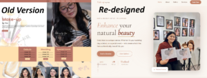
Looking at the original website alongside the redesigned version, the transformation is not simply about changing colors or rearranging elements.
The redesign introduces a more cohesive visual system across the entire experience.
The typography is more refined.
The spacing is more intentional.
The color palette feels more connected to the beauty industry.
The photography receives more visual attention.
The service information is easier to understand.
The portfolio feels more premium.
The testimonials have greater impact.
The social media content feels more integrated.
The contact experience feels more purposeful.
Every section was considered as part of the overall brand experience.
Designing With the Client’s Career in Mind
The biggest focus throughout the project was making sure the website could grow with the business.
Makeup artistry is a visual profession, and the website needed to communicate that immediately. At the same time, it needed to establish trust and professionalism for clients looking for makeup services for weddings, debut celebrations, special events, and other important occasions.
The new design balances those two needs.
It is artistic without becoming distracting, elegant without feeling overly complicated, and professional without losing the personal character of the brand.
The Final Result
This project transformed the existing Makeup by Yna website into a more polished and intentional digital experience.
The redesigned website now provides a stronger introduction to the brand, clearer service presentation, a more engaging portfolio, personal storytelling, client testimonials, social media integration, and a more effective contact experience.
More importantly, the redesign gives the business a website that feels much more representative of the quality and personality of the professional behind it.
From the initial review of the existing website to the final visual direction and development, every part of the redesign was approached with one goal in mind:
Create a website that makes visitors feel the quality of the brand before they even book the service.
The result is a modern, elegant, and professional online presence designed to support Makeup by Yna’s continued growth and help turn future visitors into confident clients.